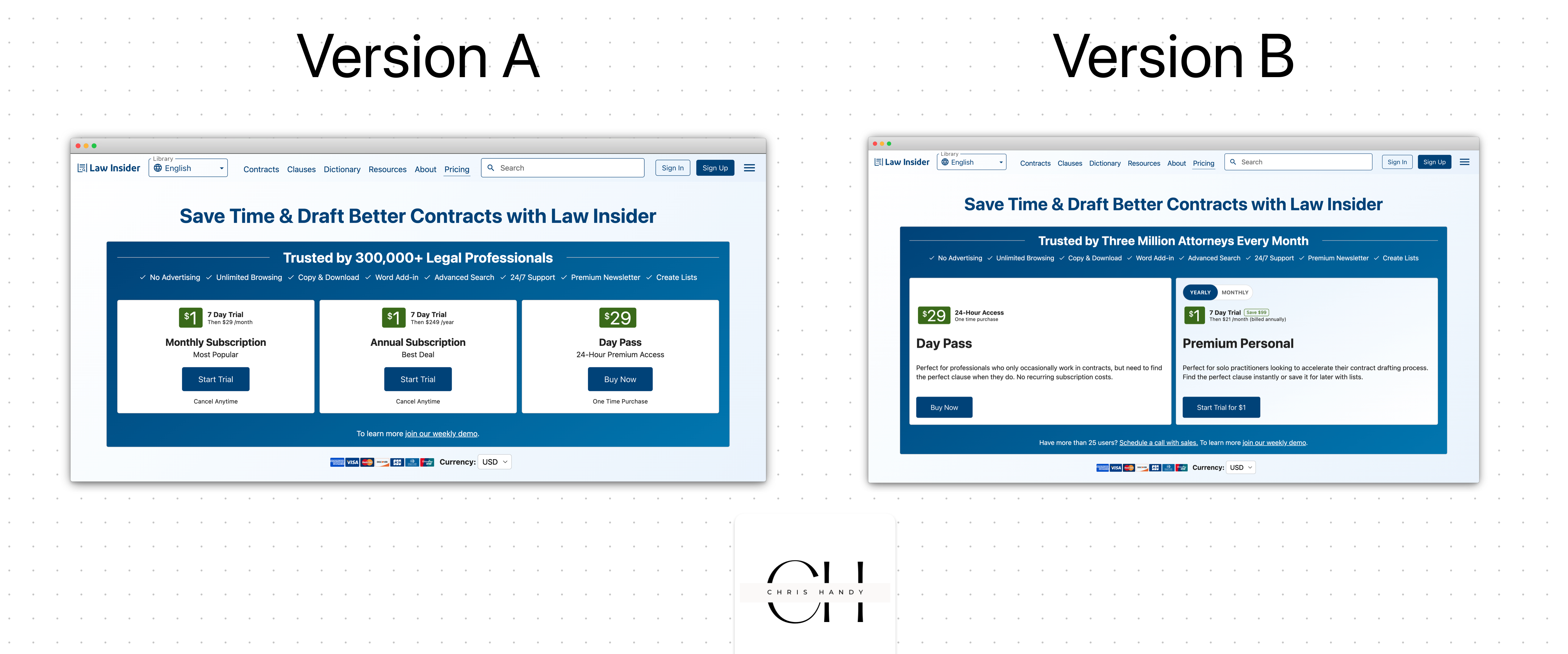
We’ve been running some tests to optimize this checkout flow and when we switched to one of them, results tanked. It led to a late night working to switch it back so we could try another revision.
Seemingly small changes have a HUGE effect on a person’s likelihood to convert. But it’s more about their ability to quickly understand things.
So here’s my prompt for you product marketers and copywriters out there is…. One of these screens in the Law Insider checkout flow gets 3x the number of signups compared to the other. Which do you think it is and why?